How to Bold Text in A LinkedIn Post (+ Tools)

Oct 7, 2024
Are you trying to grab attention with your LinkedIn posts in mere seconds? Then it’s time to bold text in LinkedIn posts to create an instant impact. Text formatting, along with other formatting options like bullet points and underlined text, can be a subtle yet powerful tool to make your content stand out in a sea of posts.
Aside from aesthetics, proper text formatting enhances the overall readability of your content, making it easier for your audience to digest your message quickly. A well-structured post, complete with bold text and bullet points, not only grabs eye-balls but also guides the reader’s eye seamlessly through your content. While these tactics may not directly influence SEO crawlers, they significantly boost engagement and encourage conversations.
In this article, we will walk you through how to master text formatting in LinkedIn posts—from boldening key points to using underlined text for better structure. By learning how to bold text in LinkedIn posts and applying other formatting options effectively.
Why Is It Important to Format LinkedIn Posts?
How do people maintain their 7-8 second attention span? It seems as though capturing people's attention is a race against time. Some people go straight into the text before sifting through it. Here format plays an important role. The benefits include improved visuals — bold words attract your audience's attention immediately and highlight important points. Improve readability — Bold text makes your message easily accessible. You have an opportunity to make it easier for your audience to remember important information.
4 types of text formats for LinkedIn
With over 11 million creators posting on LinkedIn, all are creating content offering valuable insights and experiences, how can you ensure your content doesn’t get lost in the noise?
It’s all about capturing attention within the first few seconds and then sustaining that attention with quality content. Formatting your text strategically can be the secret sauce to stopping the scroll and hooking your audience.
Let’s explore the three most impactful text formats on LinkedIn:
Bold: Make key points stand out.
Italic: Add subtle emphasis.
Underline: Highlight important phrases.
Uppercase and lowercase: Different tones for different messages.
How to bold texts on LinkedIn
Bold text is an excellent way to emphasize specific bullet points, results, or keywords, instantly drawing the reader's eye to the most important parts of your content. It helps create a well-formatted post that not only looks visually appealing but also makes your LinkedIn posts more engaging. However, like any design tool, it’s essential to use bold sparingly. Overusing bold text can overwhelm readers and reduce the overall readability of your post. The key is striking the right balance to ensure your content is impactful without being too distracting.
Unfortunately, LinkedIn’s native editor does not provide direct options to bold, italicize, or change the case of your text. This limitation makes it harder to create posts that stand out visually. However, there are simple workarounds to create a polished and professional appearance for your posts.
One of the easiest ways to bold text and create a well-formatted post is by using third-party tools. Websites such as Perfect Font Generator and Text Cleaner allow you to transform your plain text into bold, italicized, or underlined formats.
Simply write the text in the text box of LinkedIn text formatter
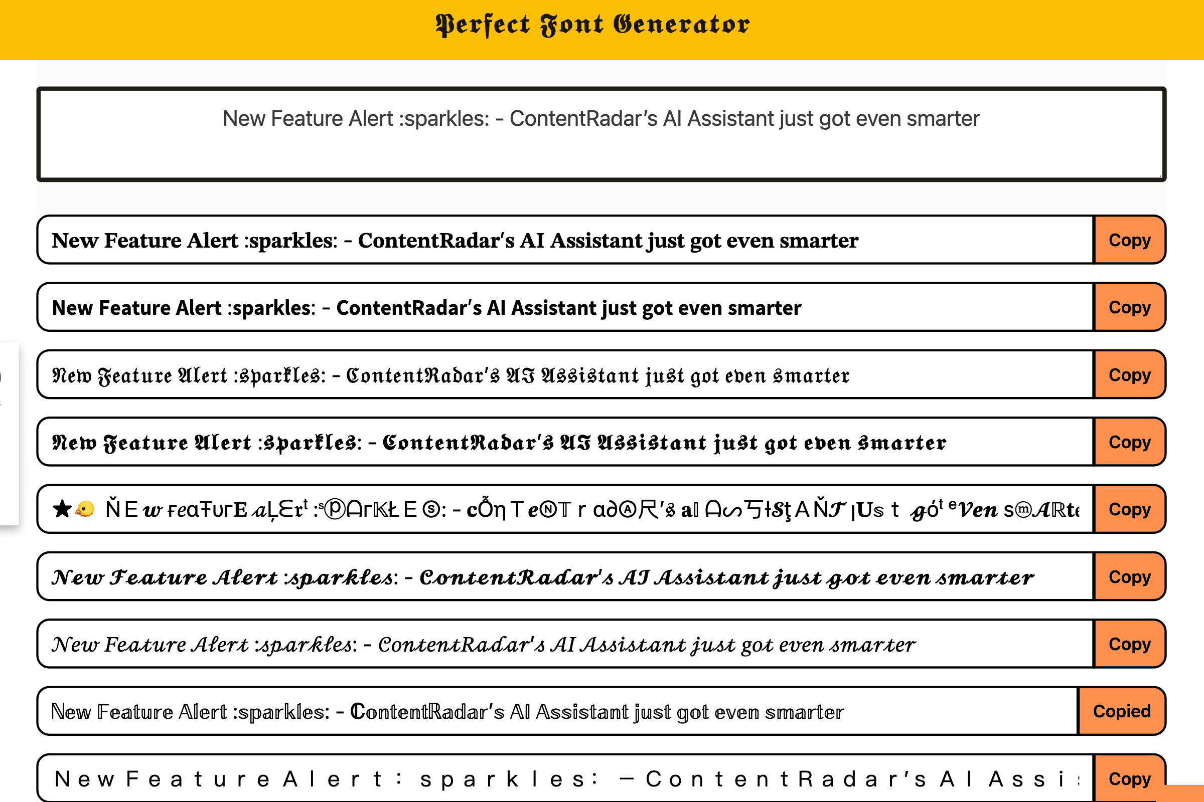
Copy the style you want to post and head over to LinkedIn post creator to paste and post.
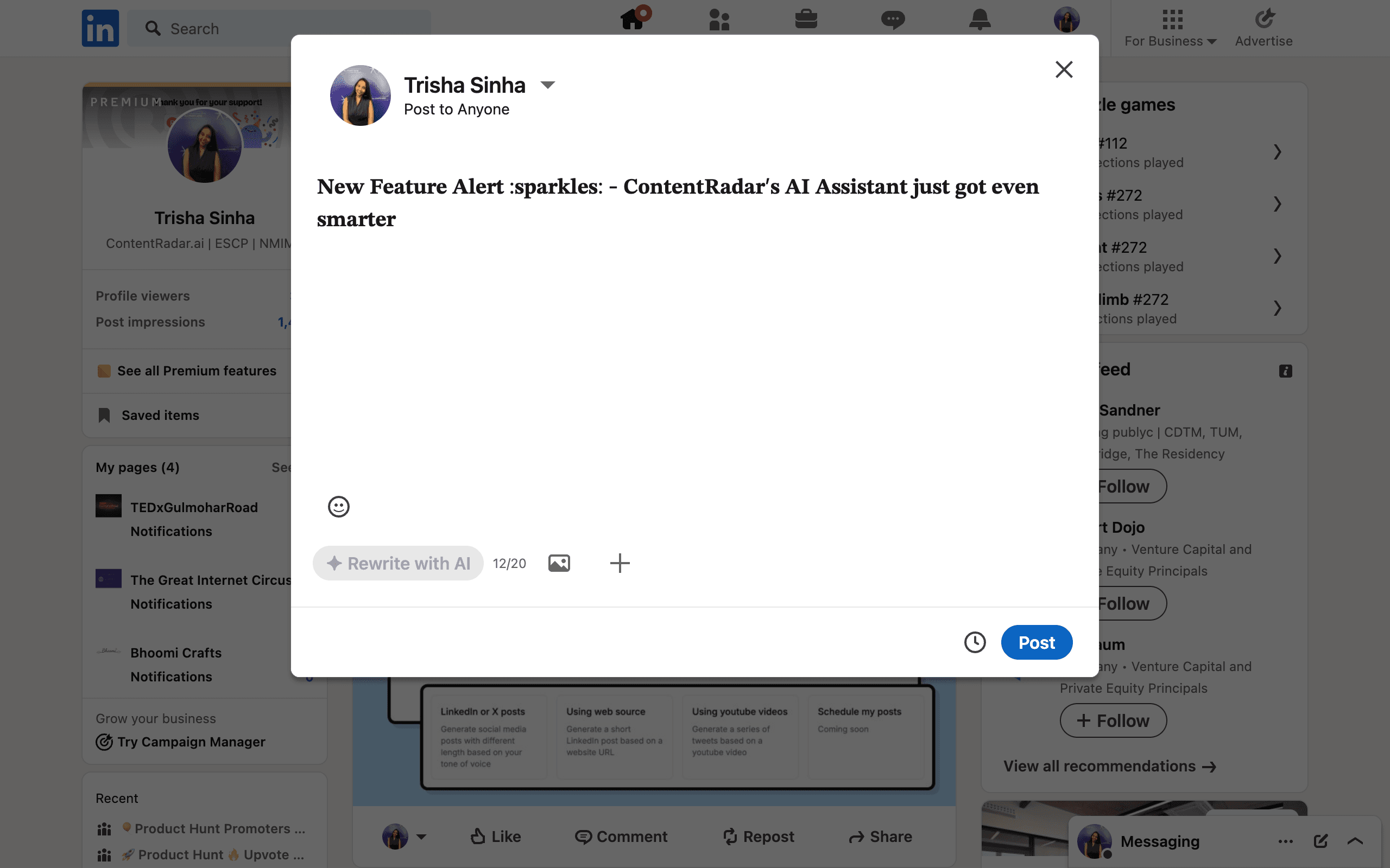
Or a simpler option is to use tools to format texts within social media marketing tools such as ContentRadar where you can format text and publish regular posts within the same dashboard. In this guide, we’ll explore both methods and best practices.
Does Bold Text Affect LinkedIn’s Search Engine Crawling?
While LinkedIn’s search engine primarily focuses on keywords and relevance, using bold text can indirectly enhance visibility. A well-formatted LinkedIn post with bold text improves readability, increasing the chances of viewers engaging with your content. More engagement—such as likes, comments, and shares—signals LinkedIn’s algorithm that your post is valuable, potentially boosting its reach and ranking in LinkedIn search results.
Although bold text itself doesn’t directly influence how LinkedIn’s search engine crawls your content, highlighting key terms or phrases ensures your main message stands out. This helps readers quickly identify the value of your post, encouraging more interactions and increasing the likelihood of LinkedIn’s algorithm prioritizing your content.
How to bold your text in a LinkedIn Post with ContentRadar
If you are a frequent LinkedIn content creator, using tools like ContentRadar can significantly streamline your workflow. This completely free tool even allows you to format your text into bold and italics while drafting your post—no need to rely on third-party formatting generators or copy-pasting between multiple tools. Let’s explore the benefits and step-by-step process of using ContentRadar for your LinkedIn text formatting needs.
Draft your LinkedIn post on post editor
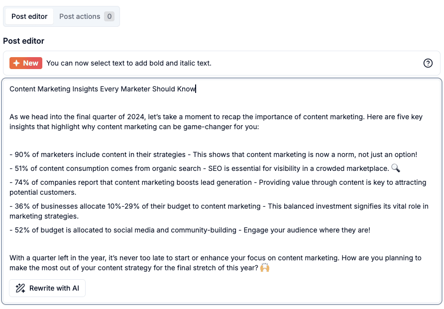
Select the text you want to format, choose the type of formatting you want from the options
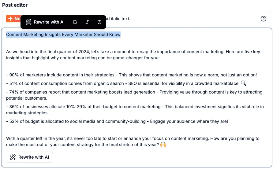
After formatting, simply schedule for publishing!
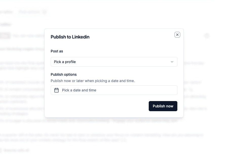
When should you bold text in LinkedIn posts?
Here are some scenarios where you should consider bolding text in your LinkedIn posts:
Highlight key data points or metrics: If your post contains statistics or facts, bolding them ensures that they stand out, grabbing attention and reinforcing their importance.
Example: “Our recent campaign resulted in a 35% increase in engagement and a 50% rise in website traffic.”Call attention to keywords: If there are specific phrases that capture the essence of your post, bold them to ensure your readers take note of them.
Example: “One of the most effective ways to grow your network is through consistent engagement. Respond to comments, share valuable content, and be active daily.”
When to use other formats in LinkedIn Posts
Formatting text in LinkedIn posts is best used to emphasize key features, highlight important details, or structure your content effectively. Use may bold text to draw attention to critical points, numbered lists to break down processes or steps to organize ideas clearly. These formats not only make your LinkedIn posts more readable but also help convey your message with precision. By using formatting strategically, you can ensure your audience engages with your content while navigating your post effortlessly.
When to use italics on LinkedIn
Italicizing text adds a softer emphasis compared to bold text. It’s often used for nuanced elements such as quotes, phrases that require subtle emphasis, or foreign words. While italics don’t pop off the page the way bold text does, they play a critical role in giving your text a conversational or thoughtful tone.
Here are some ways you can effectively incorporate italics in your LinkedIn posts:
Quoting someone: Italics are an excellent way to distinguish quotes from the rest of the text, making them stand out without being too forceful.
Example: “As Simon Sinek famously said, ‘People don’t buy what you do; they buy why you do it.’”Emphasizing thoughts or reflection: If you’re expressing a personal observation or reflection, italicizing that part can subtly differentiate it from the rest of your content.
Example: “I’ve found that consistency is the key to growing a LinkedIn audience—posting regularly, engaging with others, and always providing value.”
Highlighting names of works or publications: Italics are commonly used when mentioning the names of books, linkedin articles, reports, or other formal documents.
Example: “You can learn more about this in The Lean Startup by Eric Ries.”
When to use underline on LinkedIn
Underlining is another useful way to draw attention to specific sections of your post. It helps emphasize on links and clearly communicate the content hierarchy of your post.
Here are some scenarios where underlining works well in LinkedIn posts:
Highlighting important takeaways: Underlining can signal the most important point of your message, drawing attention to it.
Example: “The most critical factor to consider when hiring is e͟x͟p͟e͟r͟i͟e͟n͟c͟e͟. It can make or break your team.”Emphasizing links or calls to action: Underlining a link or a call-to-action helps guide readers toward the next step.
Example: “For more details, read our full report h͟e͟r͟e͟ - [link].”Separating headings from content: Underlining headings or subheadings in longer posts helps break up the content, making it easier to skim.
Example: “How to improve LinkedIn engagement”
When to use uppercase and lowercase
The way you use uppercase characters and lowercase letters in your LinkedIn post can significantly impact how your message is perceived.
Uppercase text can get attention but often comes across as loud or aggressive. It’s the digital equivalent of shouting, so use it sparingly. That said, there are times when uppercase letters work well:
Titles and subheadings: If you’re structuring a long-form post, uppercase headings can help break up the content and make it more skimmable. However, it may still come across as “too bold”.
Example: “TOP 10 SEO TOOLS (2024)”Short phrases to capture attention: If there’s a short, punchy phrase you want to highlight, uppercase text can emphasize its importance.
Example: “ACT NOW before the opportunity is gone!”
Lowercase text, on the other hand, gives off a more relaxed and conversational tone. It’s generally easier to read in long blocks of plain text anyway, and it conveys approachability. Consider using lowercase for:
Building rapport: Lowercase text can soften your message, making it feel more personal and less formal.
Example: “i’d love to hear your thoughts on this—drop a comment below!”Casual, friendly tones: If your post is more lighthearted, lowercase can set the appropriate tone.
Example: “just a quick tip: always engage with comments on your posts to increase visibility.”
10 things to keep in mind when formatting your LinkedIn posts
Here are ten essential tips to ensure your LinkedIn text formatting is effective and engaging:
Use formatting sparingly: Don’t overwhelm your audience with too much bold or italic text.
Balance visuals with text: If you’re using bold or italics, ensure they complement the accompanying visuals in your post.
Avoid formatting whole paragraphs: Focus on key words or phrases instead of bolding or italicizing entire sections.
Consider readability: Remember that LinkedIn is a professional network, so keep your formatting clean and easy to read.
Test different formatting combinations: Sometimes bold and italics can work together for more emphasis—use them wisely.
Keep mobile users in mind: Many LinkedIn users browse on mobile, so be mindful of how your formatting looks on smaller screens.
Use formatting for emphasis, not decoration: Each bold or italicized word should serve a purpose in your post.
Proofread your formatted text: Sometimes formatting can cause spacing issues, so always review before publishing.
Use third-party tools efficiently: Make sure to test the output of text generators before publishing to avoid formatting errors.
Formatting may impact algorithm crawling: Excessive third-party text formatting can hinder LinkedIn's algorithm from properly crawling and indexing your content.
Summary
While LinkedIn doesn’t offer built-in formatting options, for bolding, italicizing, or changing the case of text, third-party tools make it easy to format your posts for maximum impact. Thoughtful use of bold and italic text can help you emphasize key points, guide readers through your content, add personality, and ultimately make your posts more engaging and easier to digest.
By following the tips and examples outlined above, you’ll be able to create professional, attention-grabbing posts to create something that stand out in the competitive world of LinkedIn content creation.
Other articles
How to Block (and Unblock) Someone on LinkedIn
And When You Should
Discover how to effectively block and unblock someone on LinkedIn to maintain your professional space and privacy. This guide covers the reasons for blocking, step-by-step instructions for both blocking and unblocking, and the difference between blocking and disconnecting. Learn to manage your LinkedIn network confidently and ensure it remains a supportive environment for your professional growth.
How to Schedule Posts on LinkedIn
and Make the Process Even Easier with ContentRadar
Discover how to effortlessly schedule posts on LinkedIn to boost engagement and maintain consistency. Learn the benefits of scheduling, step-by-step instructions, and how ContentRadar can streamline your content creation and posting process. Maximize your LinkedIn presence with smart timing suggestions and AI-generated content!
How to Save LinkedIn Posts and Find Them Again
Master the LinkedIn Save feature with our quick guide! Learn how to bookmark posts, job listings, and insightful content for easy access later. Discover the benefits of saving posts, how to find your saved items, and tips for managing your saved content effectively. Stay organized and never lose track of valuable information again!
